Jungle Lab: An App for Home Slice Pizza

What if…?
Not a day goes by at Monkee-Boy world headquarters in Austin, TX without someone asking a design question that starts with these two words.
Most of the time, they’re said in connection with a current project.
What if we used a different style navigation on mobile?
What if we created visual assets that helped the client easily use more images on social media?
It’s our job to explore all that’s possible for our clients on the web—ask what if?—and then guide them toward the solution best-suited to help them meet their digital goals.
Yet we’re a team of thinkers and creators. The brain doesn’t just shut off, and, sometimes, we can’t help but ask What If...—even when we haven’t been tasked with the responsibility.
What if Instagram had a better desktop version?
What would a responsive ESPN.com look like? (They answered that one recently!)
This is why we’ve created the Jungle Lab. It’s not a real laboratory. There are no beakers and bunsen burners. It’s more like a place for the mind to experiment, an opportunity for our team to answer some of their dangling "What If..." questions.
A few times a year we’ll assemble the team and ask What If... Then, we’ll get to work on an answer, design parts of the solution, and present the result on this blog.
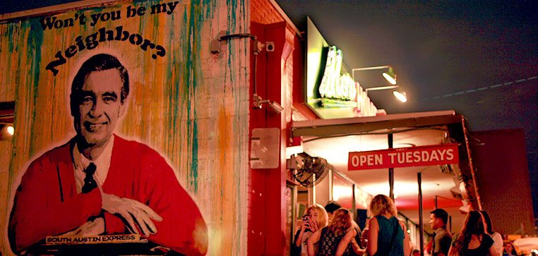
Since we live and work in Austin, and we love the city and our local businesses, every Jungle Lab will feature an iconic Austin brand.
It was really difficult to decide what local business would be the subject of our first Jungle Lab, but in the end we found ourselves in a familiar spot: we just can’t say no to pizza.
Man, do we love Home Slice, and since we eat there all the time we’ve always wondered…
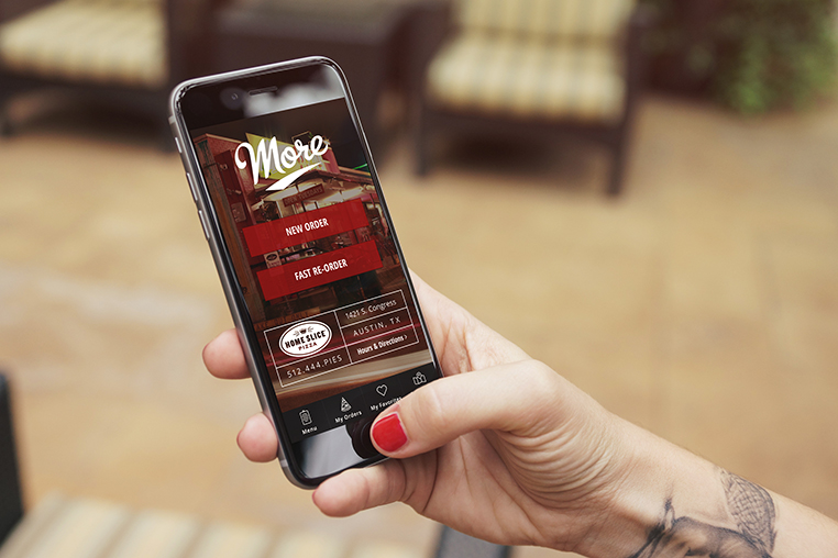
What if Home Slice had an App?
Wouldn’t that be cool? You could order some of Austin’s best pizza on the go with just a few taps and swipes. Sounds great!
But...we need to not get ahead of ourselves. First, we must identify goals and users. Before we decide what the app will do we need to ask:
Why should it exist?
And who is it for?
Normally, we’d have extensive discussions with clients to answer these questions, but because Jungle Labs are just for fun we made some choices based on best practices.
Apps, in general, and especially in the restaurant business, are primarily used to increase customer loyalty. Dominos and Pizza Hut have apps because if a customer enjoys the experience of ordering through the app—if they find it easy, delightful, and user-friendly—they are more likely to become a repeat customer that orders more often.
The pizza at Home Slice is wayyyyyy better, but a Home Slice app could do the same thing: engage loyal customers and increase the frequency of their orders.
That partially answers the second question, too. The app is for customers. However, there are different types of Home Slice customers:
- Returning dine-in customers (patron Home Slice)
- Returning take-out customers (patron More Home Slice)
Of the returning take-out customers there are also two groups:
- Returning take-out, by the slice customers
- Returning take-out, full-pie customers
There is, of course, quite a bit of movement between these groups. Multiple labels could be applied to any single customer. For example, I'm pretty sure everyone that works at Monkee-Boy belongs in every category!
However, to achieve our goal of increasing ROI from customer loyalty, and to do so using an app, focusing on the two types of returning take-out customers offers the best opportunity for (hypothetical) growth.
Why?
Well, think about it: Take-out, full-pie customers are people who love Home Slice enough to call in an order, drive over to a highly trafficked area (the heart of South Congress), and negotiate limited parking to bring a pizza home. Returning take-out, by-the-slice customers are customers who live or work in the area, they also include Austinites out on the town who aren't interested in a long sit-down meal.
Both groups already display loyalty as part of their regular interactions with Home Slice!
The app, then, can become part of that ongoing process, nurturing and growing the affection these customers already have for Home Slice and rewarding them for additional engagement.
Imagining the Product
User Flows
We began by mapping out user flows for both returning take-out, by-the-slice customers and returning take-out, full-pie customers. Using these user flows, we were able to create a rough outline of possible screens in the app.
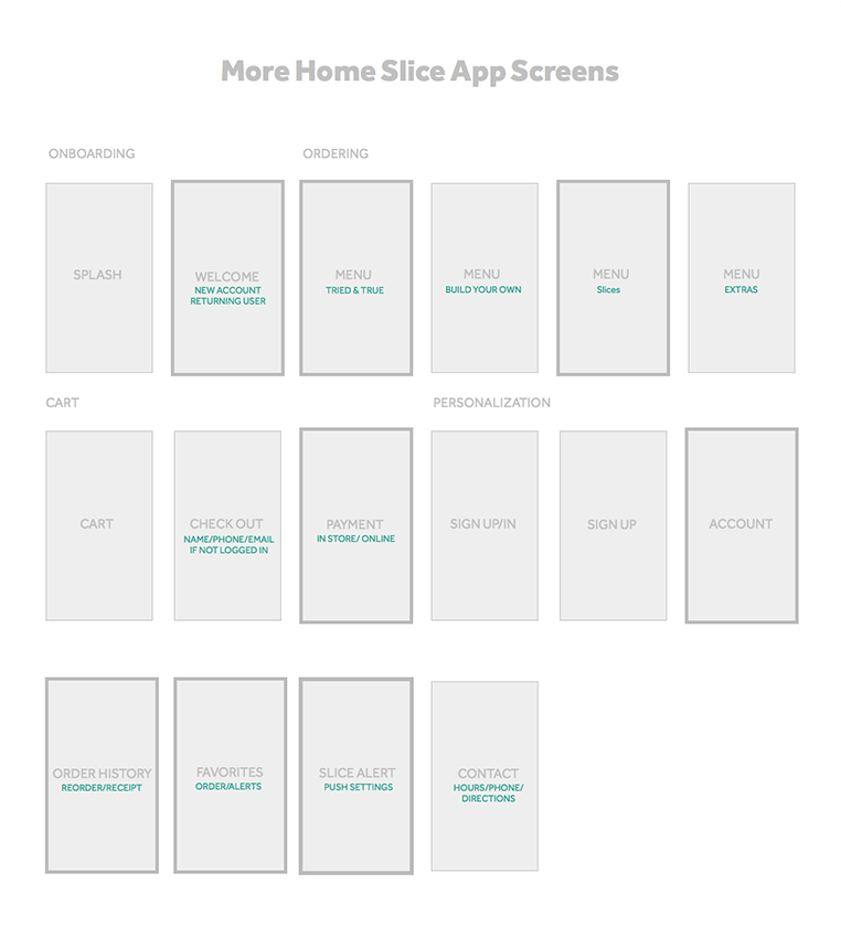
Since this is a Jungle Lab experiment, we only chose the most complicated screens to wireframe. These are indicated with the grey outline in the image above.
Wireframes
After choosing the screens to focus on, we began to wireframe and develop the app experience. Unlike websites, apps must be downloaded and installed by users. For this reason, their design must enhance the value the app would have in the user's daily life. There needs to be a good reason to download it in the first place, and a good reason to keep it on your phone. The design should be guided by both.
Here are the goals we set out before wireframing and how we accomplished them:
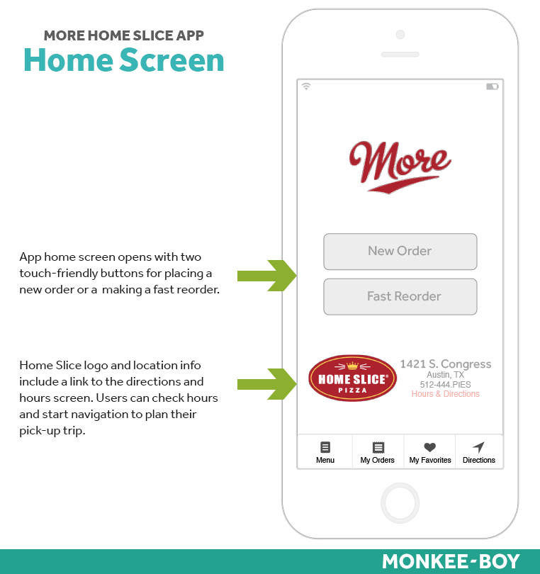
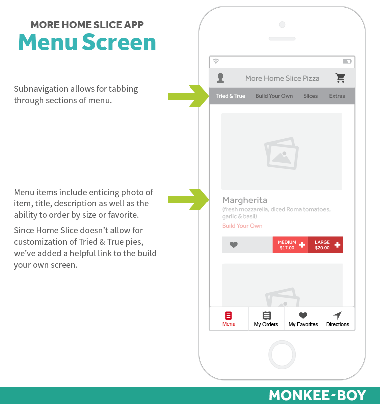
-
- Create a great level of convenience to the user through fast new order functionality, quick access to directions (to help with traffic conditions), and the ability to pay in-store or via app.
- Improve customer loyalty through personalization, allow users to save favorite menu items by size, quickly reorder favorites, review order history, and re-order an entire order.
- Tailor experience for More Home Slice by reminding users of daily specials through custom alerts for favorite slices. Users can save their favorite slices and get notifications on days when their slice is offered. This is extremely convenient for users who live or work in the area to be reminded of when to go to Home Slice for a quick lunch or dinner.
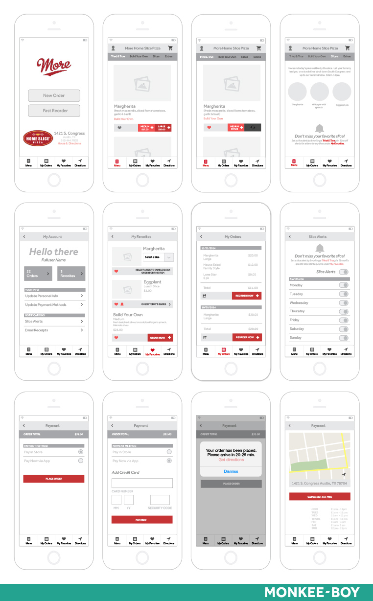
The resulting wireframes show a detailed experience for users to browse the menu, order full pies, add favorite menu items to their account, set slice alerts and more.
.png)
Design
The design for the More Home Slice app actually went pretty quickly as we built off the foundation of the existing brand. Mainly, we just wanted to ensure that the amazing in-person experience customers enjoy when they visit Home Slice came through in the design.
.png)
We comped three screens: the home screen, the Tried & True menu, and Today's Slices.
Here are our design goals and outcomes:
- Unify the color palettes from the print menus, website and physical space. The result: a darker moodier burgundy reminiscent of a dark corner booth in New York.
- Extend the experience of the physical space. We shot the building at night with a long exposure and overlayed the logo over the neon sign.
- Develop more opportunities for plucky illustrations and iconography. Illustration is at the heart of Home Slice. Their mascot is iconic on its own and their menus are adorably strewn with cute illustrations. We depicted the pizzas via illustration for the Slices screen and used fun, line iconography app menu items.
- Legible typography. We opted for a simple sans serif to compliment the script from the logo.
- Entice users at home with delicious photographs of pizza. Designing this app seriously made us hungry.
- Delight and reward users through nice interactions that build upon the overall UX engagement strategy.
.png)
Every button and interaction is designed to make the ordering process fun, fast, and intuitive.
Latest Articles

8 Ways to Optimize Your WordPress This Week
We use Wordpress to build all of our sites. In this article we’ll share 8 tips for optimizing your WordPress website for improved performance and functionality. From choosing a lightweight theme to optimizing your images, these strategies will help you get the most out of your site.
Continue reading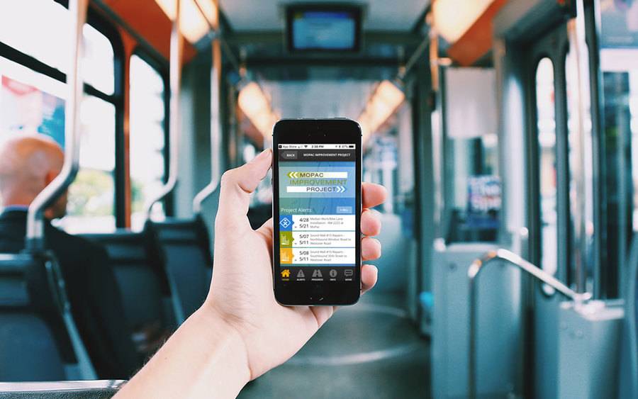
Transportation Mobile Apps: 10 Cool Features for a Better User Experience
A mobile app may not always make sense for your transportation project, but when it does, consider some of these great examples of how the right user experience can kick things up a notch.
Continue reading