Freebie Friday: Practice Hand Lettering Sheets

Within the last few years, hand lettering has changed the way artists approach the creation of any piece. Before, the thought that a logo looked hand done was kitsch, but now, expressive type is one of the more sought after types of work in graphic design.
Creating a hand-lettered piece not only allows for unique layouts, but more flexibility between letterforms, and can evoke a very specific intention that can’t be easily replicated.
What is hand lettering?
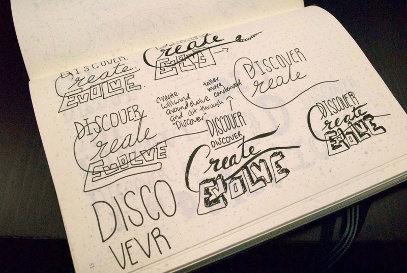
Let’s take a step back and break down what exactly hand-lettering is: it’s the art of drawing letters, while typography is more about arranging letters that are pre-formed, like a font. You could consider hand lettering closer to illustration work because artists are reimagining letters for a specific purpose.
But that doesn’t mean you can go straight into hand lettering without knowing a few basic concepts of typography.

Basic Typography Structure
Whether it’s a font or hand-lettered type, letter forms have a basic structure that they rely on for consistency. If they didn’t, you would know because it would look just off.

Letterforms rest on a baseline, an imaginary line that acts as the bottom guide for most letters (I say most because lowercase letters such as g and y will fall below the baseline). Keeping letters to a baseline helps with consistency; if you’re drawing letters at an angle, the baseline is crucial for maintaining where each letter should fall.
Another major component to creating a letter piece is the x-height, the line that forms from the tallest part of the body of a lowercase letter. Keeping a consistent x-height ensures readability and instant recognition. Fonts with taller x-heights tend to be hard to read at smaller font sizes and are mainly used for large header text.
The opposite of the baseline is the cap-height, the tallest height for capital letters. Knowing where you want the tallest part of your letters to sit not only affects your capital letters, but also your lowercase forms that extend past your x-height, including letters such as d and b. A lowercase t will extend up to the cap-height or at least past the x-height to be recognizable as a t.
In typography, basic rules are almost universally followed, but in hand-lettering, following this structure is a choice. Once you’ve learned and mastered the basics, you’re free to break the “rules” as you see fit.
How do I get better at hand lettering?
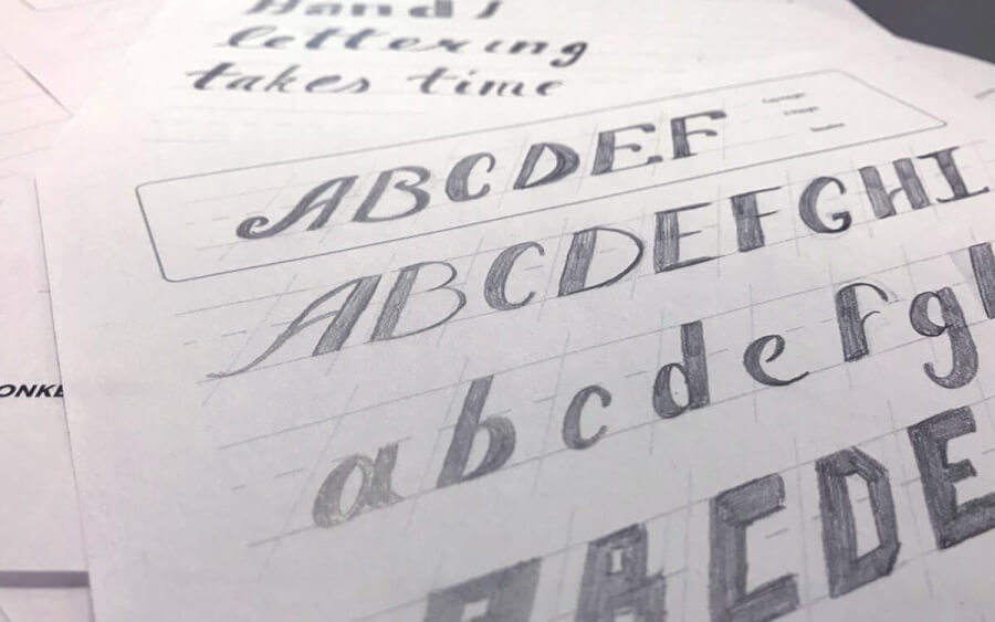
There is no magic formula for mastering hand lettering. The process may involve hundreds of hours and a bit of crying. You can’t get better at anything in life unless you put in the time and effort. With the printable lettering sheets we provide below, you’ll have the perfect canvas to perfect your craft.
What’s the most important thing I should know about hand lettering?
The biggest piece of advice about hand lettering boils down to two words: spell check. You may think I’m joking, but I’m not. When you’ve put the finishing touches on a design that’s spelled wrong, you’ll want to claw your eyes out because now it can’t be unseen. Unfortunately, there is no Command + Z shortcut in that situation. Your only option is to bust out your tracing paper and redo everything by hand.

Hand lettering resources
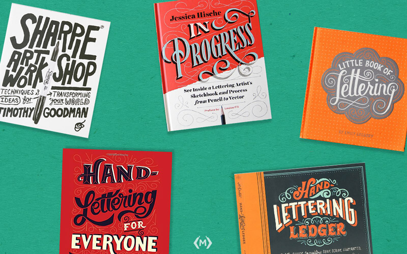
Books written about hand-lettering are great resources to study through your journey. Below are a couple of my favourites and some that I’ve been eyeing for awhile:
- Sharpie Art Workshop by Timothy Goodman
- Little Book of Lettering by Emily Gregory
- In Progress by Jessica Hische
- Hand Lettering Ledger by Mary Kate McDevitt
- Hand Lettering for Everyone by Cristina Vanko
Download Our Practice Sheets
Now that you understand more about the process of hand-lettering, it’s time to try it yourself! Download our printable Hand Lettering Sheets here.
Need help updating your digital identity? Monkee-Boy can help!
Give us some details about your next project, and we’ll be in touch!
Latest Articles

8 Ways to Optimize Your WordPress This Week
We use Wordpress to build all of our sites. In this article we’ll share 8 tips for optimizing your WordPress website for improved performance and functionality. From choosing a lightweight theme to optimizing your images, these strategies will help you get the most out of your site.
Continue reading
Transportation Mobile Apps: 10 Cool Features for a Better User Experience
A mobile app may not always make sense for your transportation project, but when it does, consider some of these great examples of how the right user experience can kick things up a notch.
Continue reading