10 Great Google WebFont Combinations For Your Next Project
Google WebFonts is an open source collection of hundreds of web-friendly fonts, amidst which hide some fantastic treasures. It requires a little digging to find high quality fonts, so that’s why we’ve done it for you. Here are our 10 favorite Google WebFont combinations for display & body copy, feel free to implement in your next project.
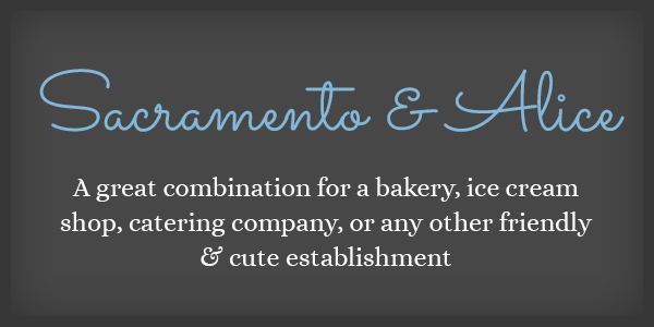
Sacramento & Alice
Download: Sacramento | Alice
This is a friendly, whimsical combination, that is reminiscent of bake shops, confectioneries, baby clothes, or any other youthful design.
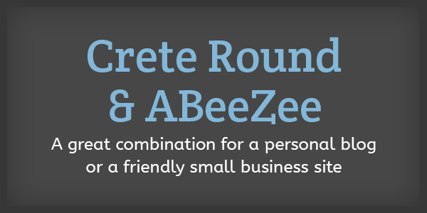
Crete Round & ABeeZee
Download: Crete Round | ABeeZee
This combination is bold and eyecatching, but the soft curves in both fonts add personality and an approachable aesthetic. This would be a great combination for a blog, some small business sites, and some apps, or a design that is appealing to a youthful audience.
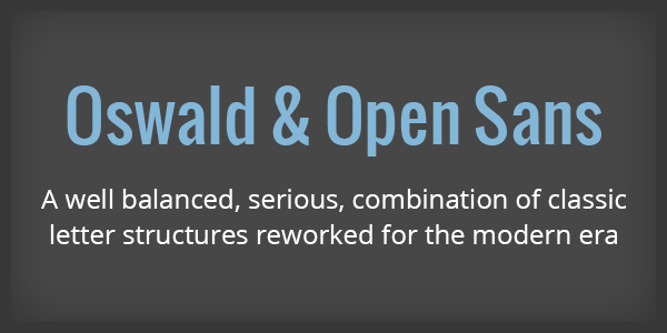
Oswald & Open Sans
This is a classically neutral combination that would be great on a variety of projects spread throughout many industries, ranging from tech, small business, nonprofit. or even personal blogs.
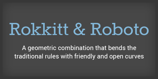
Rokkitt & Roboto
This fun combination has a clean aesthetic with a bit of playfulness. The slab serf look is very trendy right now, with the cleaner, thinner slabs being the look of the moment. This combo would work great for ecommerce.
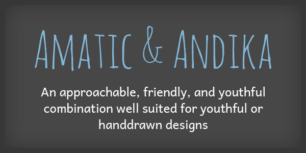
Amatic & Andika
Combining a hand drawn display face with a digitally created body copy is a nice way to balance the DIY aesthetic without going overboard. This would be great for an etsy shop, some ecommerce, personal blogs, or any site with hand drawn elements.
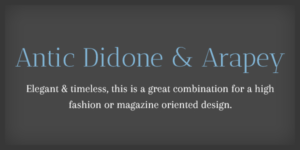
Antic Didone & Arapey
Download: Antic Didone | Arapey
This combination looks very high end – we can see this working well for fashion or jewelry luxury items in a very stark minimal design with oversized headers. Large text is a must for this combo, or the detailing would be lost and be harder to read.
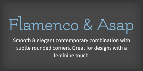
Flamenco & Asap
Flamenco is an organic, feminine font with a lot of movement and vibrancy – when paired with the contemporary rounded ASAP it makes for an eyecatching combo. This combination would lend itself more to either exotic/dance-related designs, or bakeries/cupcake shops. It might take more careful planning to integrate this set, but we think it would be well worth the effort when you find the perfect project.
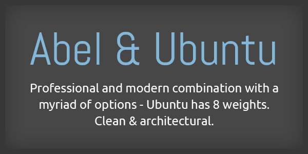
Abel & Ubuntu
This set is clean, digital looking, and neutral enough to work in tech, big business, small business, ecommerce, and more. It’s just architectural enough to be interesting, but could still be a strong look for a larger company.
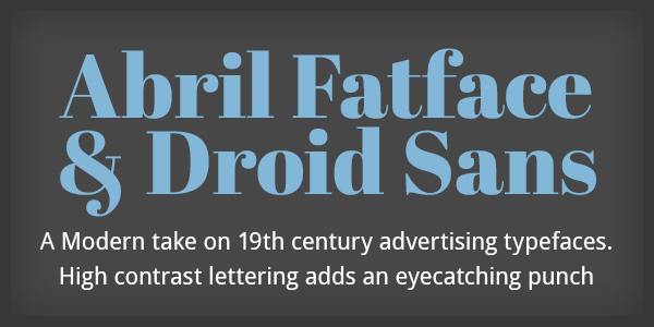
Abril Fatface & Droid Sans
Download: Abril Fatface | Droid Sans
Fatface fonts are the wildcard of the digital typography world – you don’t see many of them, but when done well, they can look amazing. This look is a tribute to old advertising typefaces and would look great drastically oversized, but doesn’t work well at small, non-obtrusive sizes. But hey, if you’re using this font, you’re probably not worried about fitting in.
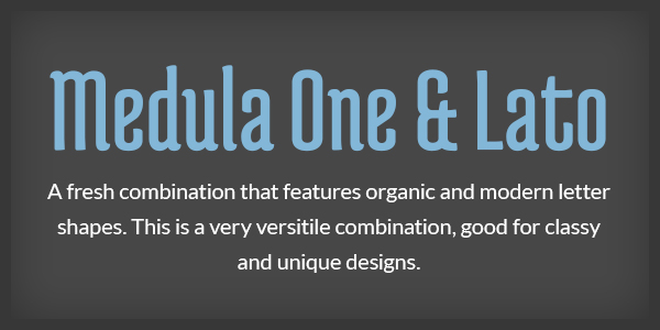
Medula One & Lato
Download: Medula One | Lato
This dramatic combination is, like Flamenco, very organic in nature. The condensed nature of the Medula typeface keeps it fresh and modern, and Lato is a chic body text option that really lets the display face shine. We can see this working well for a restaurant, bar, coffee shop, exotic goods store, or personal blog.
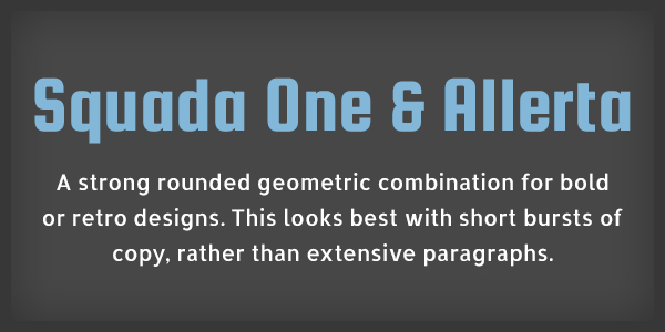
Squada One & Allerta
Download: Squada One | Allerta
This combination is the retro throwback of the bunch: Squada One references the chunky 70′s lettering look, and Allerta is a fresh modern balance to keep the look contemporary. This would be great for a portfolio, blog, or retro-related designs.
We hope you enjoyed this post! For even more type goodness, check out Our Favorite (Mostly Free) Fonts of 2012! Subscribe to our RSS and bookmark to see more posts like this.
Need help using these fonts? Get Started here.
Latest Articles

8 Ways to Optimize Your WordPress This Week
We use Wordpress to build all of our sites. In this article we’ll share 8 tips for optimizing your WordPress website for improved performance and functionality. From choosing a lightweight theme to optimizing your images, these strategies will help you get the most out of your site.
Continue reading
Transportation Mobile Apps: 10 Cool Features for a Better User Experience
A mobile app may not always make sense for your transportation project, but when it does, consider some of these great examples of how the right user experience can kick things up a notch.
Continue reading