K Friese & Associates
Increase in Page Views
Increase in Time on Page
Increase in Visitors

About K Friese & Associates
K Friese + Associates (KFA) was founded in 2003 in Austin, Texas, by Karen A. Friese, PE. KFA quickly grew into one of the most established civil engineering consulting firms in Central Texas by providing water, wastewater, transportation and drainage planning, design, and management projects services to their public sector clients. Due to its rising success, KFA was needed a new digital experience to showcase its award-winning work and help attract the right talent to support their expansion throughout Texas.
The goals of the project were to evolve the KFA digital brand to represent the organization better and differentiate it from its competitors. We also needed to showcase their increasing quality of work, depth of engineering experience, and accurately represent the company’s culture to attract new talent.
Digital Diagnostic Strategy
To fully understand their goals, audiences, and environment, we deployed our trusted Diagnostic Strategy. One of the initial challenges was helping senior stakeholders understand the value that a well planned and designed website could provide to a quickly growing organization and also how the website would help attract its future talent pool. Why do you think we just redesigned our site?
WordPress CMS with Custom Tools
To help support ongoing marketing needs, we established a content management plan that included using WordPress and a series of custom-developed content tools. Our goal was to provide KFA easily manageable tools for its team, projects, regions, events, locations, and upcoming job opportunities. All were explicitly designed to support KFA's content, ensuring they fit like a glove. With the backend in place, KFA is now completely self-sufficient and actively making changes to its site.

Showcasing the Depth and Quality of KFA's Work
One of KFA's most significant assets is its decades of engineering experience across Texas's municipalities, counties, regional and state entities. To help showcase their vast history and portfolio of work, Monkee-Boy built a custom interactive map with advanced filtering that empowers users to easily filter projects by location, sector, and/or service. The advanced tagging also allowed KFA to contextually promote specific projects to their service and sector pages, which helped its users easily navigate and explore the site.

Recreating the KFA Experience Online
KFA is a very cool engineering company with a company culture built on giving back to the community. They want to attract people who understand their uniqueness and would fit with their culture and ethos.
Two things were obvious. First, the content had to be unique. It had to speak to and attract the type of people that KFA wanted to hire and the clients who could use KFA's profound expertise.
To solve this challenge, Monkee-Boy partnered with Pierpont Communications to create and craft the necessary content to both represent and support its future growth. Pierpont has served as KFA's trusted communication's firm for years and working closely with them to help establish its business plan and external communications.
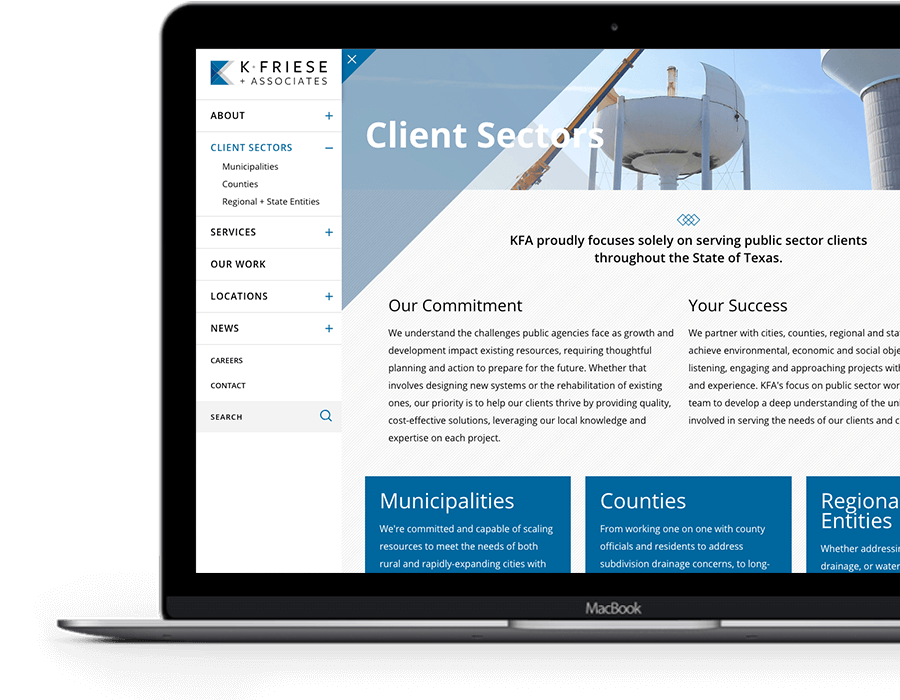
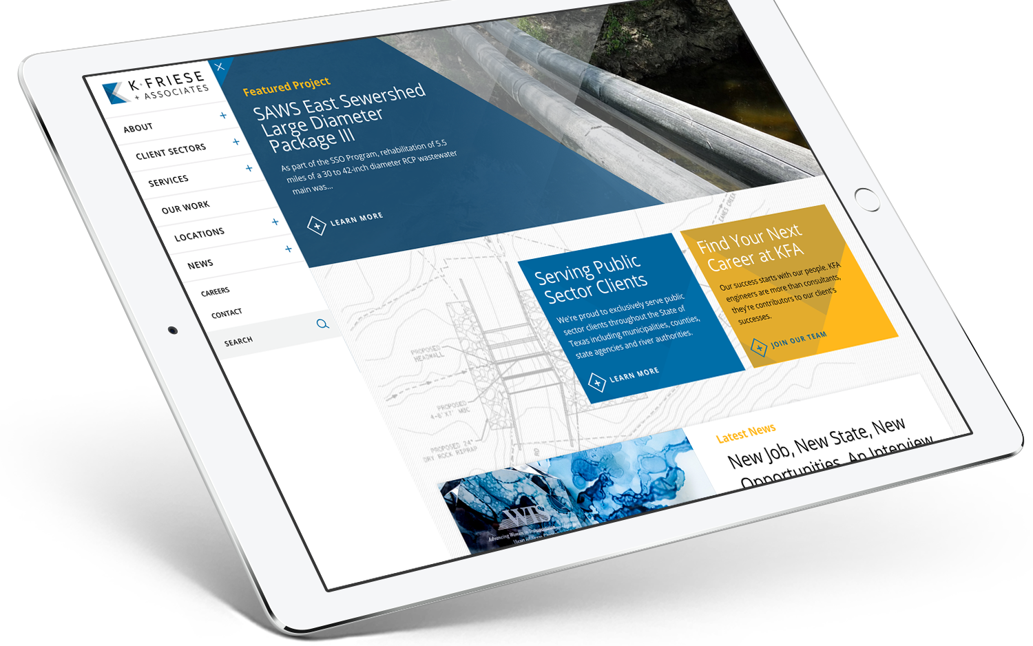
We developed a unique verticle navigation are that elegantly allows users to navigate the site, explore content, and keep the brand front and center. Setting their website apart from the competition, showcasing their work to attract new clients, and show prospective employees that KFA brings innovative solutions to the table. When a user lands on the page, the navigation is open throughout their experience, but can also be closed to immerse themselves into KFA's presence fully.

Evolving The Brand
KFA invested a lot of time and energy in building a brand that represented the company visually and stood out from its competition. Another goal was to extend the brand approach online and hold to the established aesthetics while also helping evolve it to new mediums.
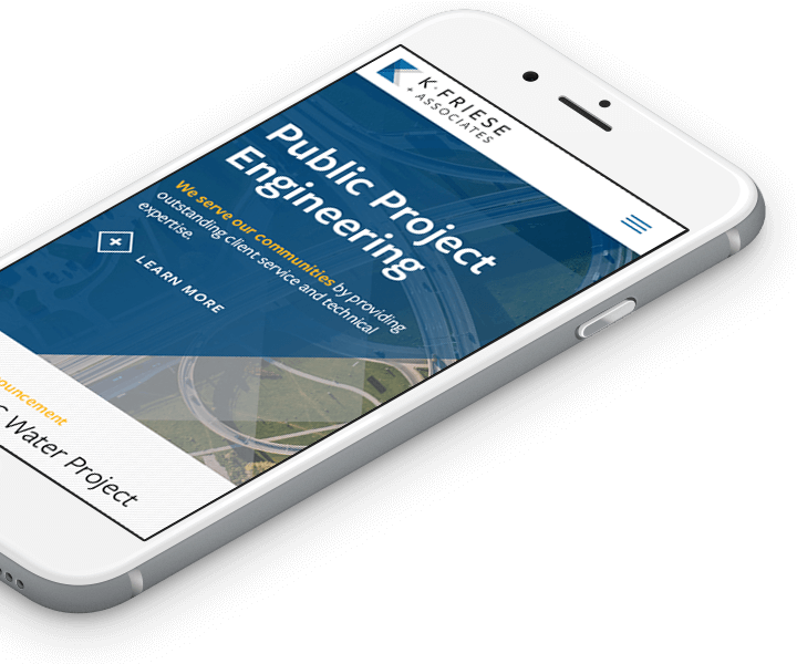
To evolve the brand, we carried forward the translucent angles from the KFA logo into the design system and interactivity, giving the site a unique aesthetic that was true to the organization and the brand.
Increased Avg User Sessions
Increase in Mobile Visits
Decrease in Bounce Rates
